Nothing in cart

April 2023 Lookbook // Dial Deco Pt 2
May 22, 2024
From March, I’ll start a 3-part lookbook I’d have a personal affection for, which is my love for a fantastic dial. Many of you readers share my sentiments regarding appreciating a tremendous dial work. It can be seen as a blank canvas for all watchmakers to paint their “art” techniques so that their philosophy could trespass from that few millimetres of space and into the eye, or, should I say, the heart of the wearer. Don’t get me wrong. I’m not talking about those matte sober ones with solid colour surfaces, indexes, and hands that are big enough to inform wearers of their purposes, like tool watches. These fundamental elements are as essential as those who need time information right at a glance. But in these few lookbooks, we will look at dials that take things up a notch in their lustrous decorations.
In this second instalment, we will look at some of our good friends like Squale and their spectacular vivid dials, and also a couple more timepieces from Japan like Seiko, who tenaciously bring us incredible dial-works on their dressy and sport watches lines. I sincerely hope in our “Dial Deco” editions; we can discover even more attributes to enjoy in timepieces that we can offer without breaking the bank. We are indeed focusing on dial aesthetics here and will not be going through the rest of the watch designs. If that’s all good, let’s get things started.
Seiko Prospex “Save The Ocean Antarctica” Monster 200M Automatic Ref. SBDY105
If you have paid enough attention to Seiko’s offering of dive watches throughout the years, you’ll come across their “Save The Ocean” series. The S.T.O initiation set the stage for a family of timepieces incorporating beautiful ocean-inspired design motifs with capable ISO-certified diving prowess. Having a core emphasis on protecting the ocean, a portion of the proceeds from the sale of each watch from this collection goes to The Fabien Cousteau Ocean Learning Centre (FCOLC), a non-profit organisation committed to marine research projects and preserving our planet’s precious waters and sea conservation organisations. I cannot feel a better partnership that could fit Seiko’s fantastic array of dive watches.

The S.T.O series has brought us different aquatic themes throughout the partnership. I have chosen one of the newer editions you can still grab today—inspired by the ice-cold landscape of Antarctica, the world’s largest marine sanctuary, this stunning new Prospex Monster Ref. SBDY105 perfectly combines Seiko’s technical expertise in producing impeccable Japanese dive watches and their efforts to conserve the precious marine environment. Over here, Seiko incorporates a unique and beautiful frosty colour scheme this time round, bringing a sense of chilly Arctic right to your wrist. The texture is spot on, as with Japan’s watchmaker’s dial work. What I love most about this is the subtle penguin footsteps on the left side of the dial. What a beautiful icing to the cake of an already extraordinary dial design.
Squale LAB Edizione 1 – Ltd Ed 200pcs
If the Seiko mentioned above has a flamboyant watch face, the Lab Edition 1 is on the opposite spectrum, which still bestows a dazzling look. This particular sub-50 Atmos series is where Gnomon Watches pushed Squale’s icon further with a contemporary twist. Besides its timeless 500m water-resistant “Von Büren” case with the Skin-diver’s L-shaped lugs and 4’o clock screw-down crown, nothing else seems quite like it.

There are two main distinctive features of this particular skin diver. First off, got to be its one-piece steel bezel that is fitted with 12 rivets, raised oh-so-slightly to create a steampunk appeal. The second one is also the most appealing feature, which lies with the watch’s sci-fi-looking, almost empty dial. The dial only boasts a few particular elements; a glow in the dar mid-ring that goes around the matte black face, only to be broken by the date display at the bottom 6′ o clock and balance its symmetry instils the italic “Squale” moniker on top. It achieved a sense of zen, with a futuristic style seeping through a more than 50 years old canvas, bringing a whole new level of attention. As if it is a little contradicting as there’s seemingly nothing much going on the restrained dial, but inevitably grasping your eyes to a certain quirkiness within.

Dievas Maya MK III Blue – Rubber
For my third selection, the latest Dievas Maya is a good candidate. At first glance, the MK III blue dial might seem like another vintage tribute of an “Explorer” dial, but it’s more than meets the eye. The 41mm beast clads a multi-layering dial – a combination of sandwich dial work and embossing; the multi-layered dial design is the other highlight of this watch. Dievas incorporated a mix of techniques in creating the dial markers for the first time. The “explorer” numerals alongside the 12 o’clock triangle marker are embossed and painted with SuperLuminova. While the remaining hour plots are etched out, leaving the luminous filled on the underside to glow out.
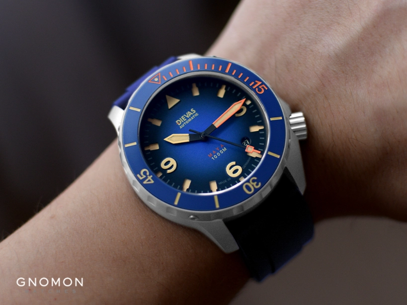
The Maya MK III Blue with its blue fumé dial is a refreshingly unique design that makes a fine example of quirkiness in classic German watchmaking. The gradual effect graduates darker towards black when reaching the dial’s circumference, distilling a lovely smokey aesthetic. Yes, the Maya has a well-thought-out interior and exterior design.

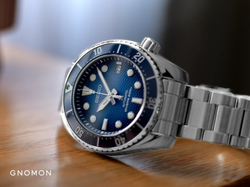
Prospex 200M Sumo Gradient Blue Sapphire 3rd Gen Ref. SBDC175

By now, you should know how this lookbook is going. I continue to stick with sports watches and thus include the all-new Seiko Sumo series. It has as much charisma on its bold round case as its gradient blue dial. The dial now boasts a gradient effect over a blue background, similarly executed to the Dievas mentioned above the diver. It now also enjoys a discreet horizontal wave pattern which reminds me of a swimming pool surface with further projects out when you view when submerging underneath the pool water. Who says a professional dive watch can’t have some excellent aesthetics on its dial?
Squale 50 ATMOS Onda Rosa
Last but not least is yet another Squale 50 Atmos. The Onda Rosa feels right in place with its dial texture and colour, demonstrating its prowess in infusing a refreshing take on their retro dive watches since its inception. What sets this timepiece apart is its gorgeous dial which captures the majestic motion of the ocean waves engraved on its dial surface with the Squale logo proudly displayed at 12 o’clock. Its dial-works is pretty well defined by its model name since “Onda” means “Wave” in Italian.

As an avid dive watch enthusiast, I appreciate how this dial graces the Onda Rosa with a nautical oceanic style that offers a contemporary update whilst retaining key elements of Squale’s classic designs and upholding brand heritage. Best yet, the infusion of a bright pink feels apt for Squale, who have seen producing some of the most vivid dive watches since the early sixties. Further, the bright pink allows this particular Onda Rosa to be a perfect unisex skin diver for most wrist sizes worldwide.


